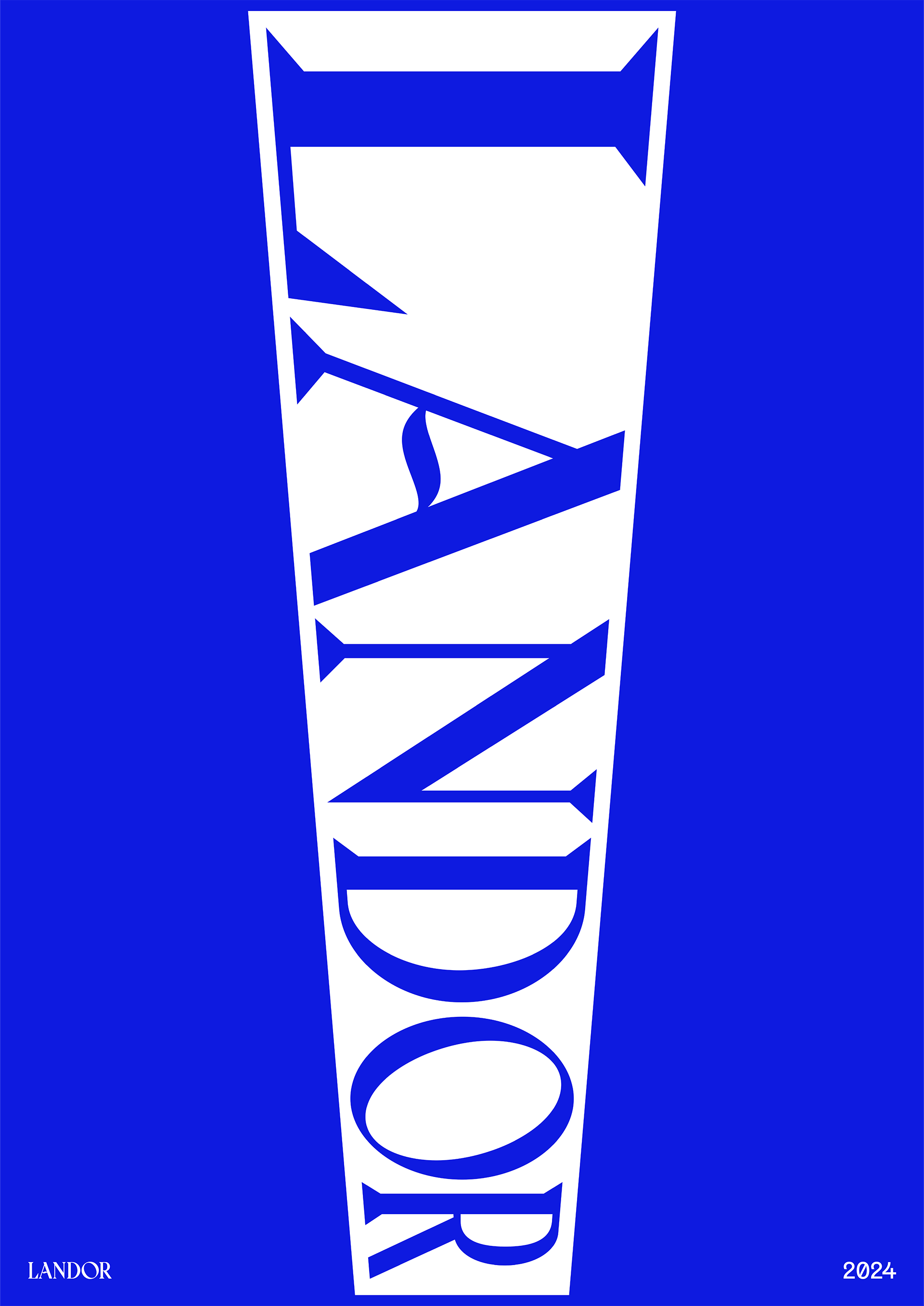

LANDOR REBRAND
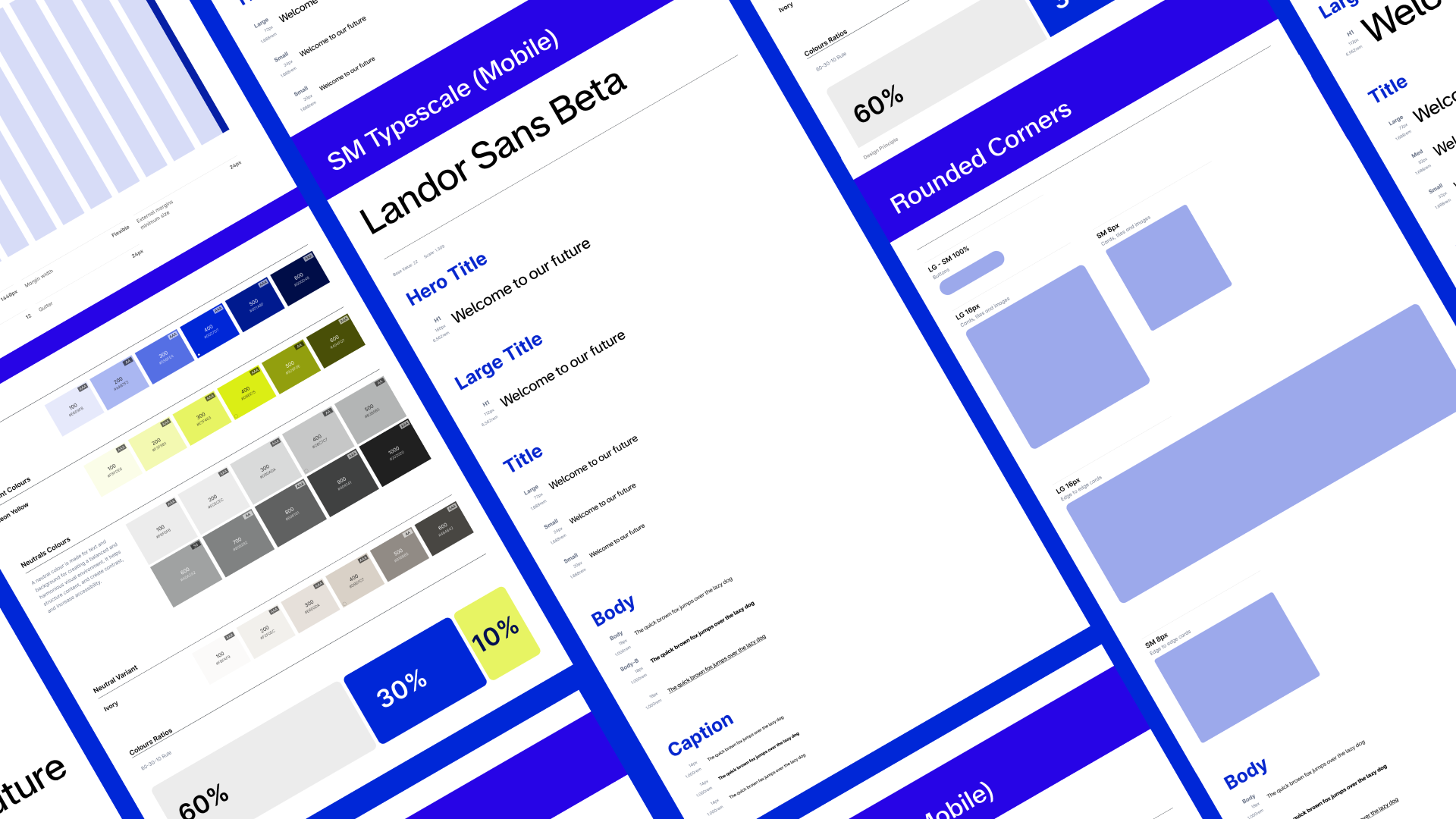
DIGITAL DESIGN SYSTEM
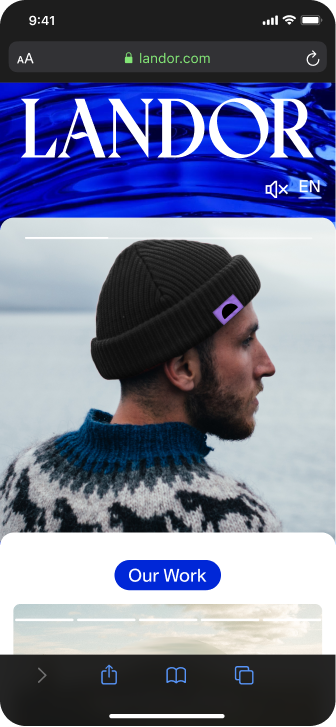
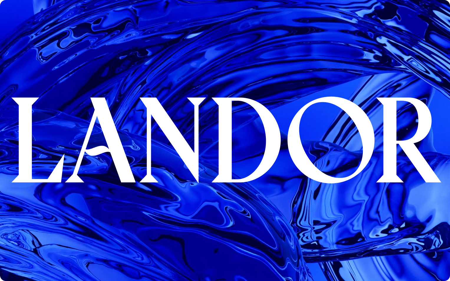
Landor & Fitch has a new look. The brand specialist rebranded as Landor with a fluid identity that features visual, verbal, sonic and motion elements.
The Story
In recent years, the WPP-owned company has expanded its portfolio through strategic acquisitions, venturing into sonic branding (amp), workspace and architectural design (BDG), and motion design (ManvsMachine). Alongside unveiling a fresh ultramarine identity, the global brand specialist has opted to remove the term 'Fitch' from its name, a reference to its merger in 2020.
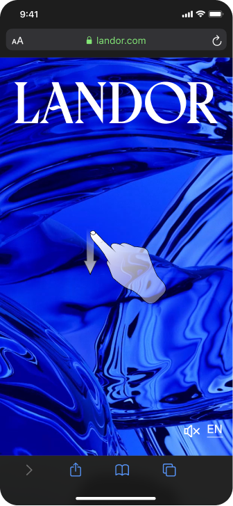
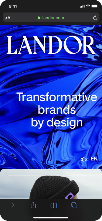
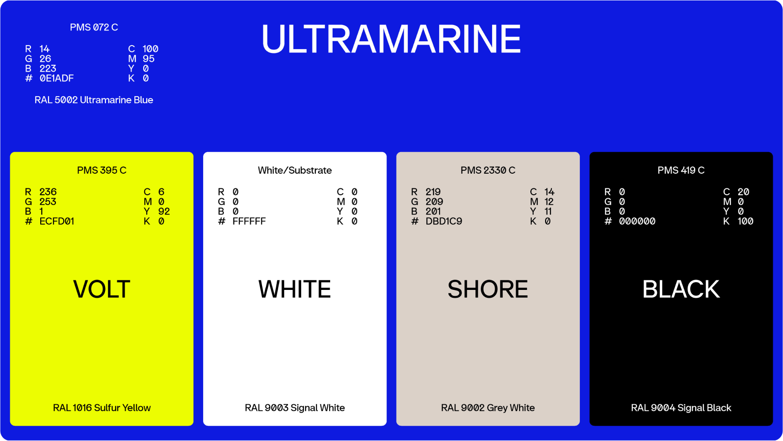
Many of these enhanced capabilities are showcased in the updated Landor identity, featuring notably sleek motion design. The inspiration behind the work stems from water, echoing the brand's origin story of Walter Landor founding the company on a ferry boat in San Francisco harbor. Revisiting this narrative, a new core color, ultramarine, is introduced—a rare pigment imported during the Renaissance, frequently employed by artists.
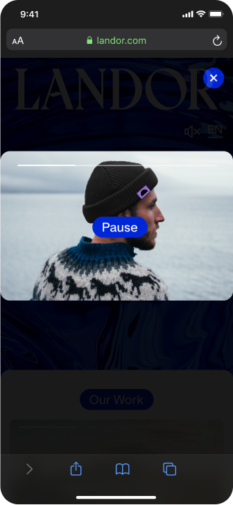
The Brief - Define and develop a flexible design system for the newly rebranded Landor Agency.
The challenge - Define and develop a flexible design system from the newly rebranded Landor Agency.
The brief - Creative direction and design for web, mobile and animation principles.